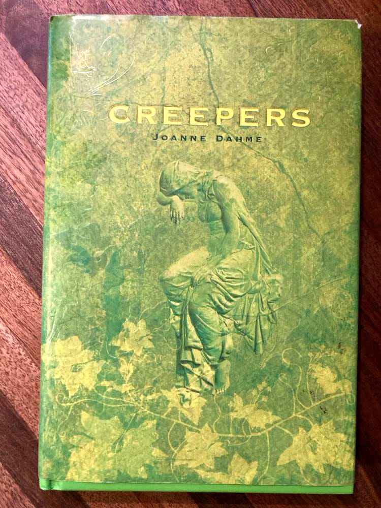
Before I get to the end(papers), I want to share another book I found at my local library in Selinsgrove, PA, for the low, low price of a single dollar: Joanne Dahme's Creepers. While I knew nothing of its author, several things about this book separated me from my hard-earned cash. The first is the title. If you're someone like me who enjoys a horror-tinged tale, then a title like Creepers will always get your attention. Upon closer inspection, I found it clever that the "creepers" in question are vines of ivy growing thick over cemetery headstones. This scene tickled my imagination.
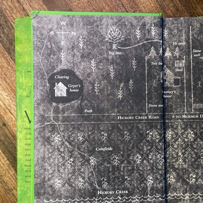
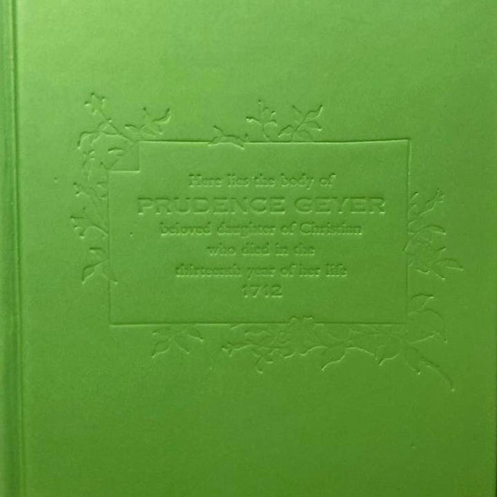
But beyond the title and concept, the book's design by Frances J Soo Ping Chow made me pull a bill out of my wallet and give it to the librarian. A lot of thought went into the design of this novel, from the spot gloss on the jacket to the embossed casing to the burial plot endpapers to the interior art that features such things as clippings from newspapers. Even little details, like every page tinged slightly green, attracted me to it. I can only imagine how delighted first-time author Joanne Dahme was when she saw this edition. It's quite a debut.
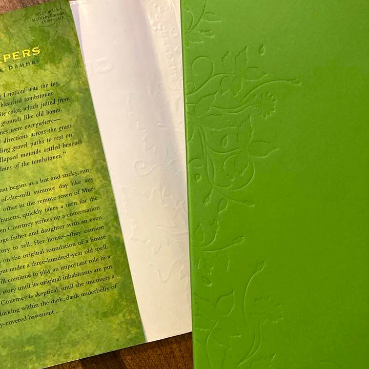
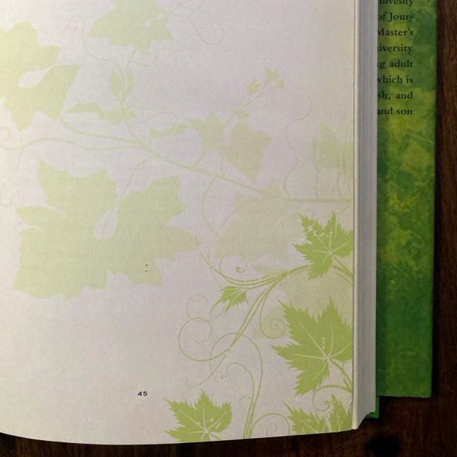
To top it all off, on the back cover, there's an endorsement from Goosebumps author, R. L. Stine:
"Who doesn't like a good ghost story? Creepers is a good one! Thrills and chills? You bet. But it will also warm your heart!"
Was Stine correct? Did it warm my heart? Mm. Mildly. But to be perfectly candid, I wasn't as moved by it as by other recent reads, such as Sweep or The Wish Tree. But those are high bars to clear. Were there thrills and chills? A few. I enjoyed the setup and some concepts but hoped it would be much creepier. But tastes vary, and my expectations may have interfered with the read. It's a cool-looking book, and if you're looking for a ghost story that won't necessarily keep you from losing any sleep, this is worth checking out.
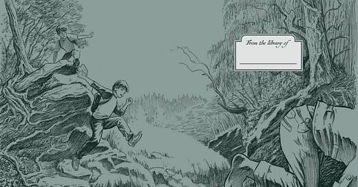
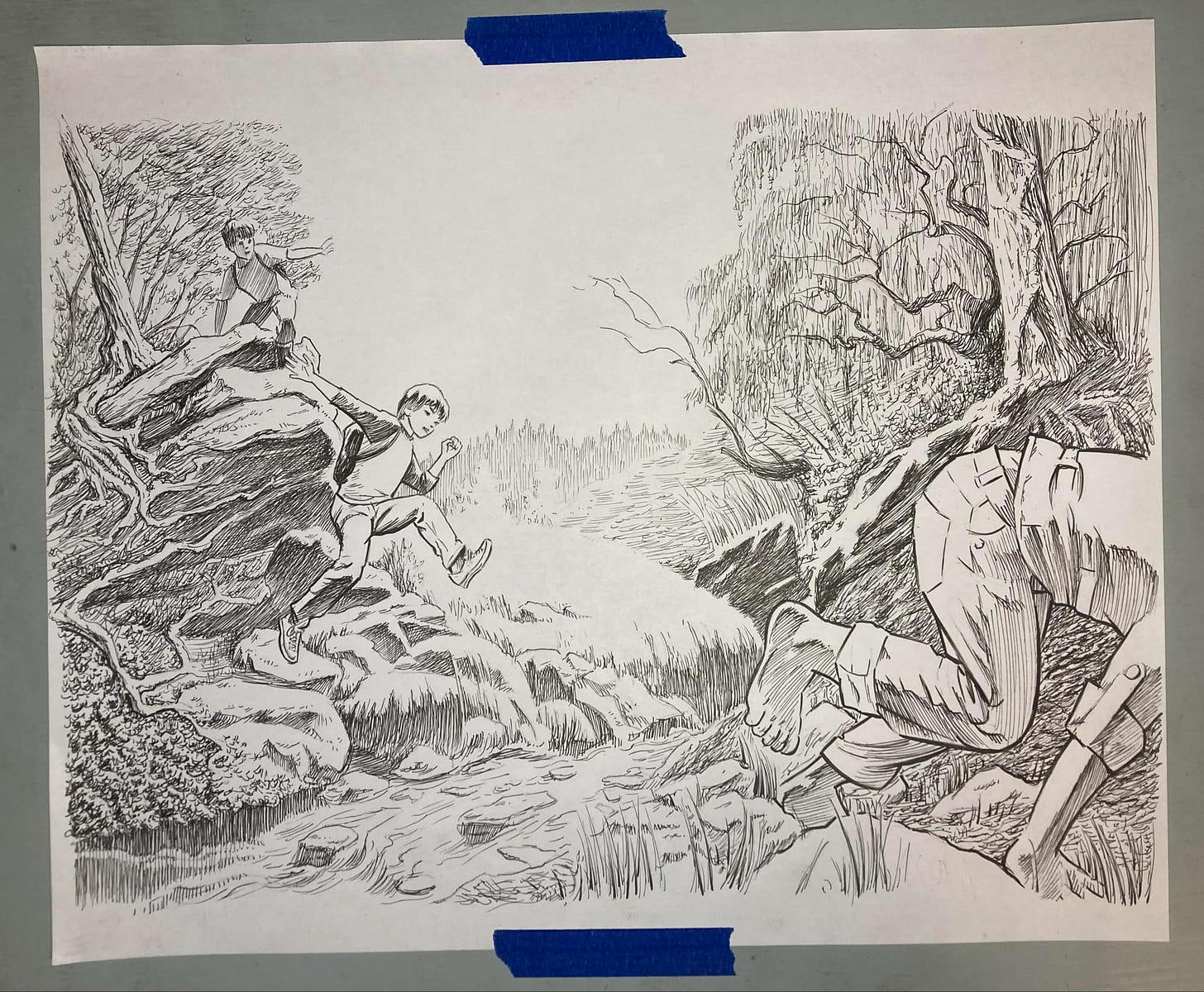
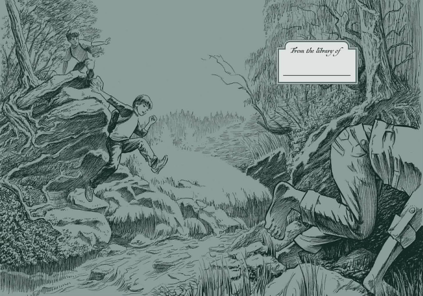
Since we last met, I’ve been working on the creation of endpapers for the “Bespoke Edition” of my debut novel, The Mystery of A Nubbins. Here’s a step-by-step look at how it came together.
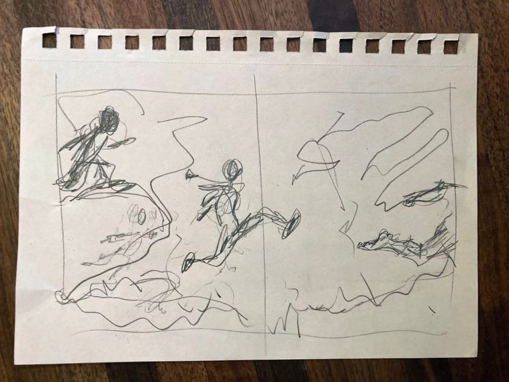
First, I put down super-loose thumbnail drawings on small scraps of paper. This step solidifies the general idea that's been floating through my mind. It doesn’t look like much, but I will constantly refer back to it. In this case, my "big idea" is to fully use the double-spread by showing my characters racing across it.
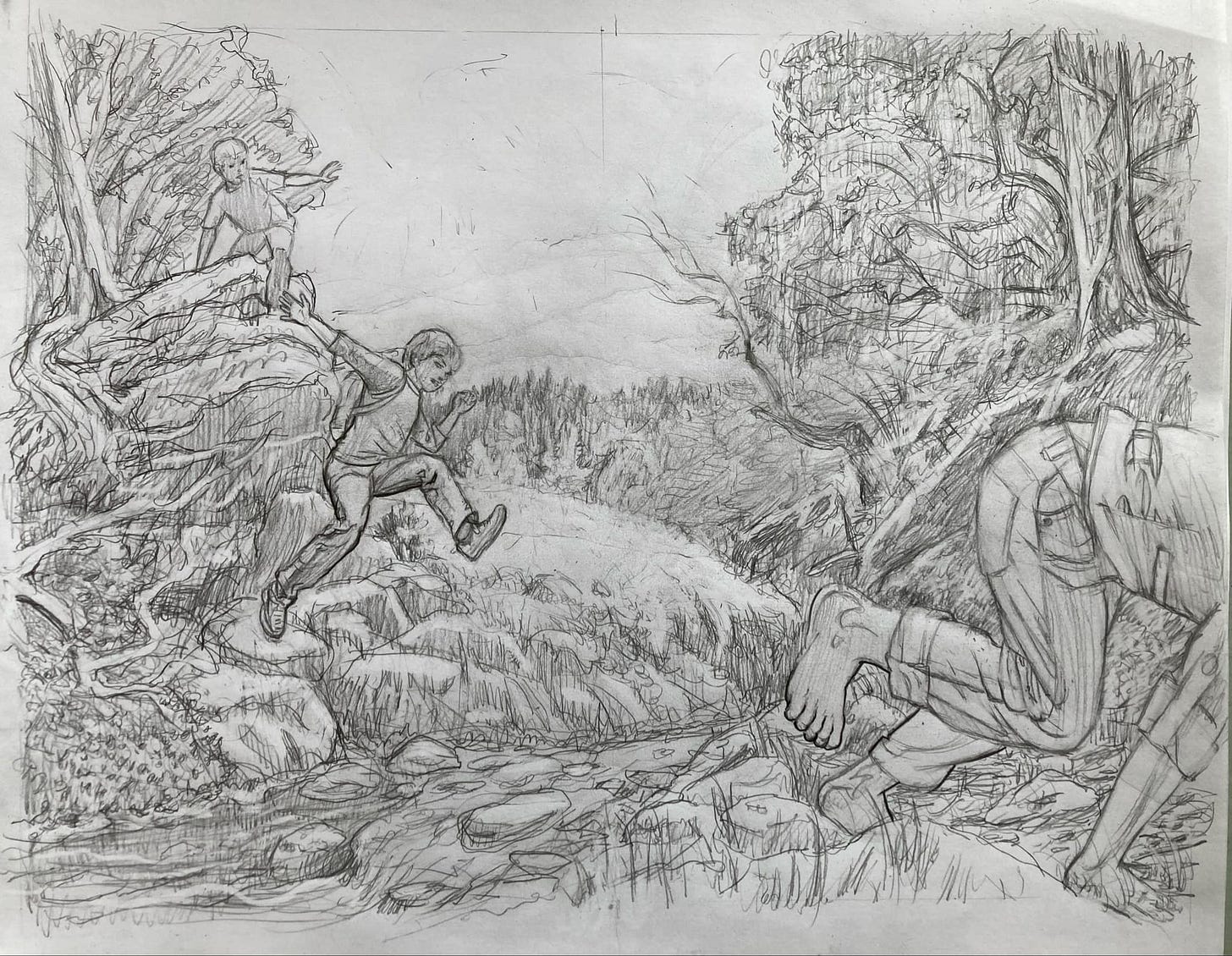
Once I sold myself on this concept, I took out a sheet of 14"x17" layout paper and worked out the anatomy of my characters and the general shapes and contours of the landscape. At this stage, I begin piecing together reference photos to help me nail down the details and fashion a realistic scene.
In drawing something I intend to ink, I aim to bring it to a finish where I can have fun with the inking and not fret the details. As the saying goes, "Pencil tight, ink loose." That said, I always feel like I could be tighter with my pencils and freer with my inks. So at this stage, I transferred the drawing onto a clean sheet of 14”x17” layout paper, held my breath and inked the entire thing in a few hours with a set of King Art Inkline pens I received as a Christmas gift.
Finally, I scanned it into Photoshop at 400 dpi, converted it to a bitmap image, brought it into Indesign, set the type, and chose the colors. Although full color was available at no extra cost, I chose the minimal two-toned approach since it puts me in the mind of the endpapers I enjoyed so much as a youth on such books as The Three Investigators.
And that’s it. Soon it’ll be off the printers and available for sale—Stay tuned!!
Until next time, Always Be Creating!
Best,
Bill


